
Project Overview
I joined as the sole UX designer at Another to take GotMine, their new B2C flash-sale platform helping retailers liquidate excess inventory, from 0 to 1. Over the course of the internship I built the product's component library from scratch, then scaled it into end-to-end screens across the shopping app, SMS purchase flow, and marketing site, with the full experience scoped for a September 2026 launch.
My Role
uiux design, PRODUCT MaNaGEMENT
Collaborators
FOUNDING TEAM, engineers
Timeline
2 months (2025)
Tools
Figma, claude, linear
“how might we help retailers offload excess inventory through a flash-sale experience so effortless that a shopper can go from text message to purchase in seconds?”
THE PRODUCT
GotMine
GotMine turns retailers' overstock into limited, time-boxed drops that shoppers unlock over SMS. I designed the system end to end: the text-to-buy purchase flow that needs no download, the companion app that keeps shoppers coming back between drops, and the component library that let the team ship both consistently under deadline. Three goals shaped every screen:
Effortless Purchasing
Strip the flash-sale checkout down to a single SMS reply so the gap between "I want this" and "I bought this" is seconds.
Curated Discovery
Let shoppers subscribe to brands and creators so they will always be alerted of the live offers made by them.
Retained Engagement
Give shoppers a reason to open the app between drops: wishlists, referral rewards, brand and creators browsing.
To ground the product in real shopper behavior, I synthesized customer interviews, survey data, and secondary research on how deal-seekers currently discover and buy discounted inventory.
Research
Market Analysis
I benchmarked 8 indirect competitors — cash-back, earned-rewards, influencer-code, and resale models — against 2 direct competitors that are also flash sale platforms, mapping each on commitment level, seller credibility, and real user complaints.
Competitive Positioning
*size correlates to popularity (# of Appstore Reviews)
Direct Competitors
Indirect Competitors

While the market appears to be highly saturated, there is one clear gap that GotMine should intentionally fill: a resale platform that is both low commitment and trustworthy.
1
Low Commitment
Users can access flash sales in just a few clicks; no posting, engaging, or ongoing effort is required.
2
Trustworthy
Platform leverages brands and creators buyers already trust and creates opportunities to deepen that trust over time through order tracking and live action feedback.
Research
Aligning With Consumer Needs
To steer clear of potential frustrations our target users may face, I compiled App Store reviews of the 9 platforms (Cake isn’t available on the App Store) from above, taking note of what users liked, disliked, and hoped for in these services.
App Store Reviews
Direct Competitors
Indirect Competitors

Pain Points
High commitment platforms that require active participation
Inventories that feel like a dump with no curation by taste/size
Deals expire before shoppers realize they existed
Desire Points
A trustworthy, low-effort checkout
A clear sense of savings and reward for loyalty
Because I was the only designer on the team, I started by building a UI kit and component library, typography, color (navy/cream/mustard), buttons, cards, form inputs, nav patterns, before wireframing a single screen. That system is what let me scale from low-fidelity flows to full end-to-end coverage of the app, SMS flow, and website fast enough to hit the September launch scope, and it's what the engineering team builds from going forward.
Visual identity
Building the System, Not Just the Screens
Branding
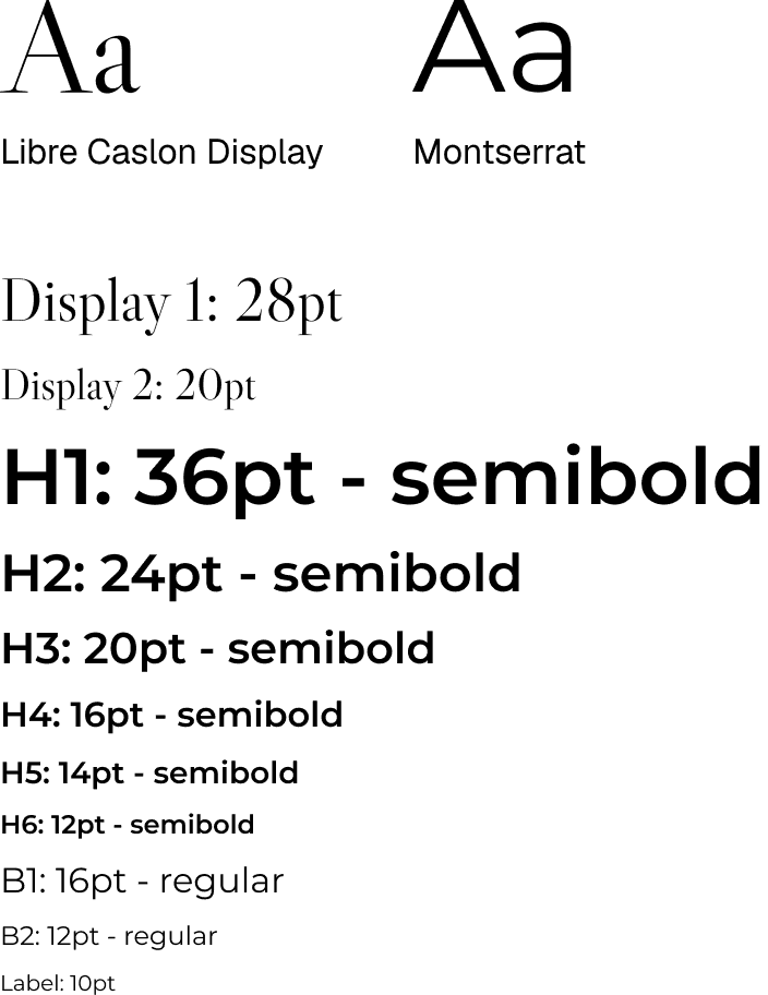

UI components
Pills

Cards
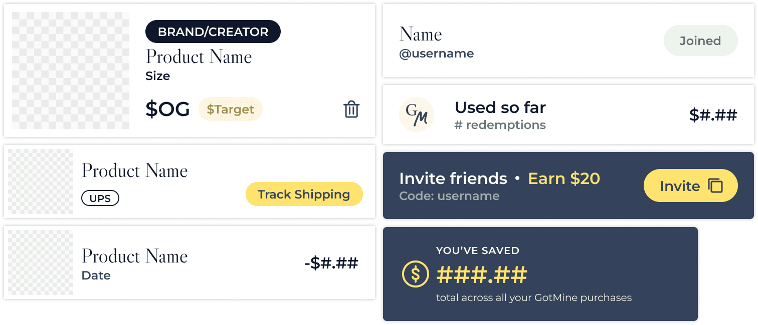
Live Offer

Upcoming Offers
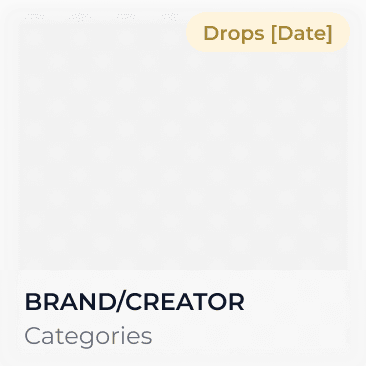
(Feed)
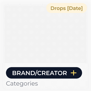
(Explore)
Past Offers
Visual identity
Finding a Creative Direction
The landing page of a platform is of utter importance; the first few seconds of a user’s experience on a new platform shapes the overall conversion rate. I brainstormed 4 creative directions, each with a different goal in mind.
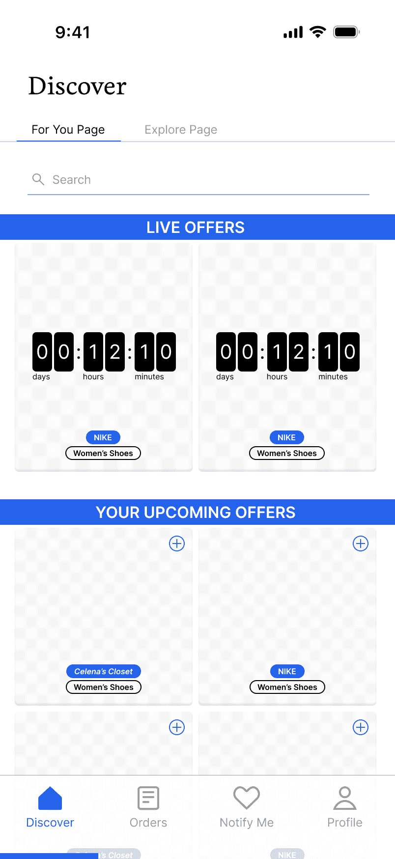
Flashy

Clean
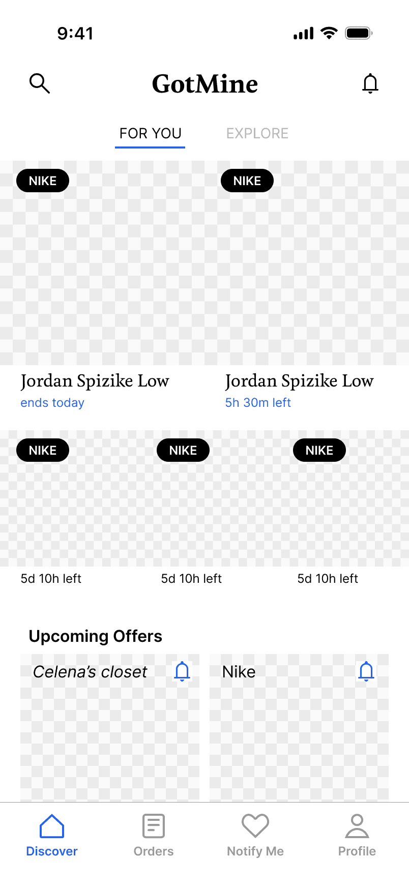
Hierarchy

Engaging
The team decided on a design that emphasizes engagement.
After extensive discussion, on top of conversion rate, I kept 3 main goals in mind while designing the GotMine experience:
1
Exploration
Making exposure to new brands and creators extremely accessible to encourage high subscription rates.
2
Anticipation
Fueling users' curiosity about what and when the next live offer is launching.
3
Incentives
Creating incentives for users to consistently engage with GotMine both online and offline.
PROTOtyping
Live Offers — FOMO
Offers by brands and creators go live one at a time and users either see them under their Feed (if they are subscribed) or their Explore (if they aren’t subscribed).
PROTOtyping
Upcoming Offers — Unboxing
Compared to the singular live offer, there are much more upcoming offers throughout the platform. With the image blurred, minimal information is intentionally given about the product for a sense of mystery.
PROTOtyping
Wishlist
Shoppers can request specific products with target prices using our Chrome extension. That data flows back to our team and is shared with retailers as a live demand signal. This turns "what should we discount next" from a guess into something GotMine can actually show them, directly supporting the liquidation goal at the center of the product.
PROTOtyping
Rewards &
Referral Loop
A high-return rewards system is implemented where shoppers "Earn $20" for each successful referral. This not only creates a referral loop, attracting initial user-base upon launch, but also turns one-time deal shoppers into repeat subscribers.
Takeaways
Being the sole designer on a 0-to-1 product meant every decision, from the component library's button radius to the words in a purchase-confirmation text, was mine to make and defend. I learned how much of "product design" at an early-stage company is really systems thinking: building a library disciplined enough that screens I hadn't even scoped yet could still ship on brand and on deadline. Designing a purchase flow that lives inside a text message also pushed me to think about UI beyond the screen, tone, timing, and trust matter as much as layout when the "interface" is a string of SMS replies. This project sharpened my instinct for shipping fast without losing the shopper's trust in the process.
