
Project Overview
I reimagined TikTok's Local Feed to help users move from passive discovery to real-world visits. Through competitive analysis and app reviews, I identified a gap between finding interesting businesses in videos and confidently navigating to them. I designed a new Map Mode experience with synced filters, creating a clearer path from content discovery to offline action while preserving TikTok's existing interaction patterns and minimizing implementation risk.
My Role
Product designer
Collaborators
Timeline
1 week
Tools
Figma, claude
“How Might We Help Users Move From Passive Content Discovery to Confident Offline Actions?”
THE PRODUCT
TikTok's Local Feed
TikTok's Local Feed is effective at helping users discover nearby businesses, but the experience is largely passive. This disconnect between content consumption and action is rooted in a lack of support for intentional, reliable, and actionable business discovery. This created an opportunity to redesign the experience around more intentional local exploration.
Local Feed is blended with general content
The current experience can feel like an extension of the FYP rather than a dedicated tool for discovering businesses users can actually visit.
Difficult to discover specified local businesses
Users must either have completely unguided exploration (scrolling) or know exactly what they’re looking for (search engine), no
in-between.
Time sensitive content can become outdated
Business hours, promotions, and offerings change frequently, but content in the Local Feed isn’t organized by time and users are unable to filter out older content.
defining problem space
Consumer Persona

Maya Chen
new grad living on a budget
2C: Visitor
Goal
"I want to find quiet, local, family-owned cafés to study in"
Frustration
"I scrolled past a cute café on my For You page last week, but I have no idea where it actually is, or if it's even open during my breaks."
Current Action
Scrolls Local feed passively: rarely acts on what she sees because usually can’t find any details on the proximity of where events or local cafés are.
defining problem space
User Goals & Pain Points
Introduced earlier this year, the Local Feed was integrated into TikTok with the intent to expand on TikTok’s ongoing successful in growing small businesses. The feature “makes it easier to live like a local”, whether that is “rediscovering your own neighborhood” or being in a “new city for the first time”.
Current
Rooted goal: help small businesses grow
but...
content includes entertainment, which overshadows the local businesses the page is trying to support
can view in map mode where one location is, but not everything [saved] simultaneously
scrolling format less efficient in supporting offline engagement, especially for smaller businesses
Target
User
Platform
2C
*focus for redesign
locals- to connect with community
visitors- to explore nearby businesses
clear differentiation from For You page
2B
small businesses- to gain online presence & offline traction
more level playing field for small businesses
Design Goals
User Goals
Connect with community
Explore nearby businesses
Pain Points
Don’t know where stores are (nearby not intuitive enough)
Not enough details/status known
Not knowing how to take action
Why?

defining problem space
Metrics of Success
GotMine turns retailers' overstock into limited, time-boxed drops that shoppers unlock over SMS. I designed the system end to end: the text-to-buy purchase flow that needs no download, the companion app that keeps shoppers coming back between drops, and the component library that let the team ship both consistently under deadline. Three goals shaped every screen:
1
North-star metric: Local tab session frequency / Day-7 return rate
2
Supporting metrics
Session Rate - whether users can find relevant content more quickly
Time spent on map and search engine
Time spent scrolling
Feature Adoption - whether the new features are intuitive and useful
Post-feature engagement rate vs. baseline
% of sessions where at least one filter is tapped
Time-to-first-tap (discoverability)
Business Impact - whether the new features actually help the 2B users or if the engagement is stuck online
before/after views and engagements for small-business posts
exit rate to business websites/maps for navigation
3
Guardrail metrics
Local Feed Opt-in Rate - should be stable or increase
FYP Engagement - should be stable because Local Feed shouldn’t be replacing For You page traffic
defining problem space
Design Constraints & Tradeoffs
Designing for a pre-existing application means that logistics for implementation plays a large role. For this, I considered numerous design tradeoffs.
User vs. Business
Optimized For
Possible Tradeoff
Trustworthy discoveries
Give lower-reviewed businesses more visibility
Trustworthiness vs. discovery of emerging / lower-reviewed businesses
Current, up-to-date content
Businesses shouldn't need to post consistently to be discoverable
Content freshness vs. low posting burden for businesses
Passive, engaging discovery
Drive intentional real-world foot traffic
Passive entertainment vs. action-oriented local discovery
Reliable, established businesses
Grow small-business presence
Reliability of established businesses vs. exposure for small businesses
Adopt known, successful FYP algorithm
Avoid cannibalizing core FYP engagement
FYP familiarity vs. differentiation from the core FYP
feasibility vs. Accessibility
Optimized For
Possible Tradeoff
Low cost/risk
Creative flexibility
Fast implementation
Integration with external platforms
Easy readability
Using icons to avoid clutter
Fast discovery
Many filter options
Before implementing new features, I studied successful precedents to identify the design qualities worth carrying forward.
competitive landscape
Small-Business Friendly Platforms
Mapped features that appear on top platforms with similar impacts on radar charts to pinpoint features that may support the goal of supporting small businesses.
Categories
# of business types
Formats
# of promotion/posting types
Distance
how well of knowing whats closest/farthest
Social
how much active engagement with posts
Reviews
frequency of followup engagement
Categories
Formats
Distance
Social
Reviews
1
Nextdoor
SOCIAL
Verified-neighbor endorsements are free and organic, with no ad spend or virality required. This is exactly the customers a small business wants,

2
Google Maps
MAPS
Free business profile, ranked by proximity and relevance rather than popularity; the review system builds trust without needing to go “viral”.

3
TripAdvisor
REVIEW
Excellent for tourist-facing businesses, but only reaches people already in trip-planning mode; no specific support for everyday local errands.
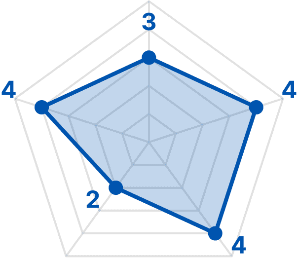
4
Beli
REVIEW
Genuinely merit-based ranking that encourages reviews and discussions, but it only exists for one category: food.

5
Facebook Marketplace
SOCIAL
Good for one-off resale, but there's no ongoing storefront presence or repeat-customer relationship for a business.

Categories
Formats
Distance
Social
Reviews
Two features that were highly correlated to the platform's success at supporting small businesses are:
1
# of Reviews
2
Distance Metrics
I went through the logic from user flow to feature, ensuring the end product was not only independently intuitive, but also cohesive with the existing TikTok Local Feed, before using Claude Code to generate a walkthrough of my proposed design integrations.
design direction
The Missing Link Between Passive Exploration & Active Discovery
To bridge the current gap, I propose 2 features:
1
Map Mode
--> to discover experiences visualizes distances & directionsremoves barrier to physical visits
2
Filter Pills
--> to narrow down follows existing user habits controls over content consumption
design direction
Redesigning the 2 User Flows
No specific destination or activity in mind
Knows what type of local business they want to find
Current
supports target flow 1
minimal ways to narrow down search, making targeted exploration difficult
only allows free exploration with no constraints (time, location range, category)

Target
supports both target flows
still have the choice to scroll for exploration but using tools, we try to help them reach their goal quicker in the flow

design direction
Primary Feature: Map Mode
3 Precedent Design Directions

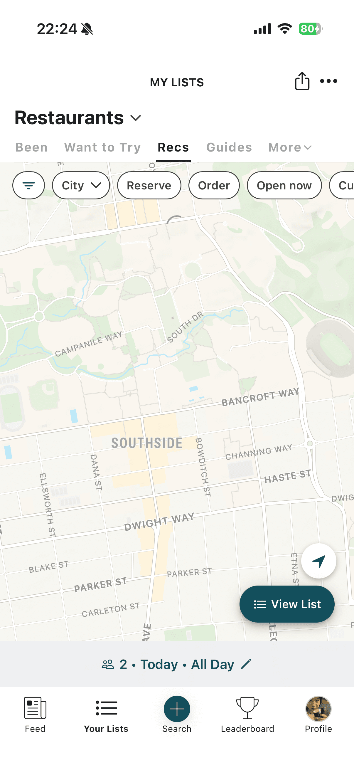
A. Map CTA as floating toggle
may block primary content
stands out from other filters
clear “new” step

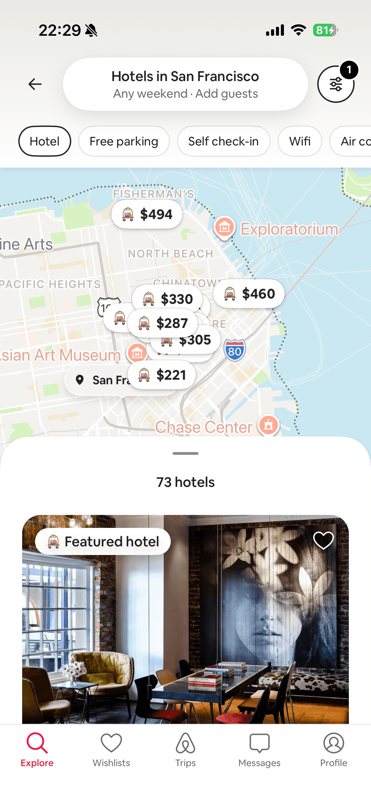
B. Map as main page
new interaction for users
content becomes secondary draggable sheet


C. Map CTA button next to filters
keeps original layout for primary content (optional new feature for long-term users)
clean UI, low clutter
C is best for implementation for TikTok. There is least implementation cost and risk because the primary content of the Local Feed would be preserved and only familiar interactions are integrated, increasing potential adoption rate.
Smooth Integration

Entry Point: Default Content Display Mode
Entry Point: Map Mode
Connection
Existing Feature
New Feature
Primary content also appears under each location (existing design that is placed in a general map)
Preserving original TikTok design and layout so users don’t feel misplaced or confused
1
Map Style
A visualizer and motivator (pain point)
Clear CTA for offline discovery: direct links to Apple/Google maps (pain point)
Minimal details, only main roads and areas labeled
2
Local Business Content as Centerpiece
Map designed around the locations, including “TRENDING” and number of clips from location
Saved locations can now be viewed as collective


(saved locations)
design direction
Supporting Feature: Synced Filters
Filter Pill Design

A is the safest, most readable choice. While E hits more standards for the purpose of supporting small businesses, it diverges from TikTok’s style aimed for quick information consumption.
Filter Content
Radius - distance metrics (pain point & competitor landscape)
Status - for time sensitive locations and events (pain point)
Categories - details for slightly narrowed down search (pain point)


Radius
<1 mile - walkable location
<5 miles - quick driving location
Explore my city - connecting with extended community

Status
Now - spontaneous visit
today/this week - planning ahead within rapid content cycle
design solution
Primary Feature: Map Mode
design solution
Supporting Feature: Synced Filters
Takeaways
Through this project, I learned how to move quickly from insight to execution. By leveraging competitive research, vibecoding, and an existing component library, I was able to rapidly prototype and communicate a complete product vision despite limited time for iterative user testing. The experience taught me how to make informed design decisions with imperfect information while staying grounded in user needs, business impact, and technical feasibility.
