Project Overview
With our local bike shop as our client, this project is one of close-collaboration where we gave iterative design strategy-based consultation. The final product is a comprehensive redesign of BikeWalk Tompkins that integrates marketing, spatial planning, storage systems, and digital access into one efficient system that aligns well with their current branding.
MY Role
UI design, branding
Collaborators
Angie Ko, Basi Woldenburg, Jingze Wang, Julia Zhang, Neen Tangcharoenmonkong
Timeline
2 months (2024)
Tools
blender, revit, figma
“how might we propose budget-friendly design strategies to help extend Bikewalk’s mission of ‘working to make Ithaca and Tompkins County a community where walking, biking, and rolling are safe, convenient, & accessible for all people’.”
Looping in community
System of persistent feedback from customers to keep up with recent trends and present needs
Retaining active clients
Cultivate physically active and consistently engaged enthusiasts by equipping customers with skills to become independent biker
Reliving the life cycle
Personify the bike and extend its useful life by repurposing bike parts and passing down the biking tradition down generations
Through interviews and on-site visits, the following needs & problems were identified:
Research
Getting to Know to the Community
Customer Retention
New Customers: students and tourists
Difficulty locating shop entrance
Feeling overwhelmed at workshop
13.0%
Customers currently use bikes
Current Customers
Difficulty being serviced during peak hours
Difficulty fitting open workshops into schedule
≥50.0%
Costumers seek affordability
Customer Interaction
Physical Space Users
Difficulty accessing bikes
Difficulty navigating through cluttered space
University Students
Discouraged from biking due to being unaware of resources
Familiar with BikeWalk services but difficulty recognizing brand
We met with our client three times over the course of the project, in addition to maintaining consistent online communication. Initially, our team found it challenging to clearly define their specific needs; however, through iterative feedback and back-and-forth discussions, we developed strategic interventions from multiple angles that ultimately came together as a unified deliverable.
PROPOSED OPPORTUNITIES
Recognizable Branding
Mission & Goals
“We’re building a healthier, more inclusive community where everyone can move freely and thrive together”
Short-Term
Consistency across spatial, digital, and product designs.
Long-Term
Grow network to connect community and organization beyond the physical space.
Logo

Memorable Active Colors
Create consistent visual branding to increase recognizability of BikeWalk
PROPOSED OPPORTUNITIES
Reach the Community
Brochure Distribution
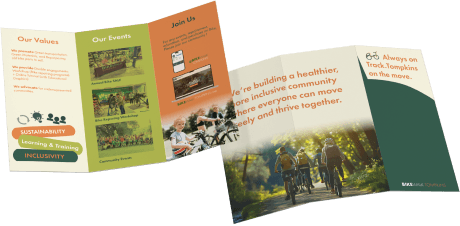
About BWT Brochure
To introduce new visitors on BWT’s mission, focus, events, and how to follow up with the latest updates
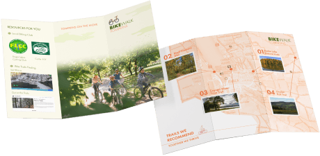
Building Community Brochure
To help people interested in biking learn about available local opportunities (clubs, trails, and websites)
Merchandise Distribution
Sell and hand out bike-related products with BikeWalk branding for the community to reach out of the shop

PROPOSED OPPORTUNITIES
Accessing BWT from Home
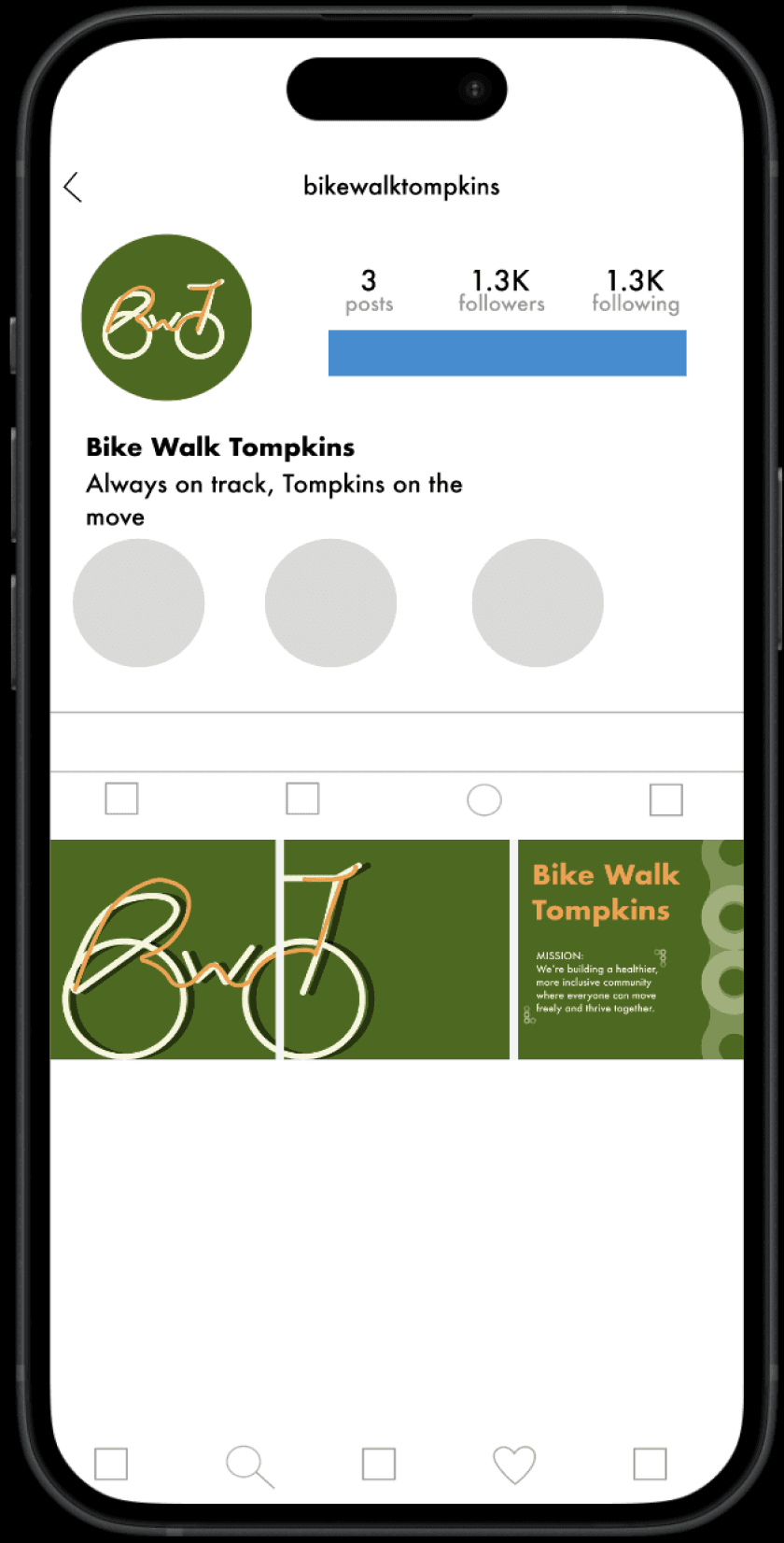
Social Media Cleanse
About BWT from Home
To create a new track for which to connect with BWT. Increase online community by enhancing the visual unity of the Instagram and website. Easily access opportunities to connect with the community and acquire information.
DIY Repairs
Repair-learning from Home
Develop an online tutorial section to extend the reach of BWT Bike repairing expertise.
Option to click on the “By Parts” menu bar or directly by clicking the bike.
Bike Browsing
Browse Bike Selection from Home
Develop an online inventory to provide a look into BWT offerings directly from your home. Ease congestion in the store while helping costumers streamline the process of choosing a bike.
Option to sort through inventory by different categories.
exterior design
Intuitive Way-finding
“Designing an exterior space that facilitates the way-finding of BWT while also increasing awareness of community events. “
Pain Point
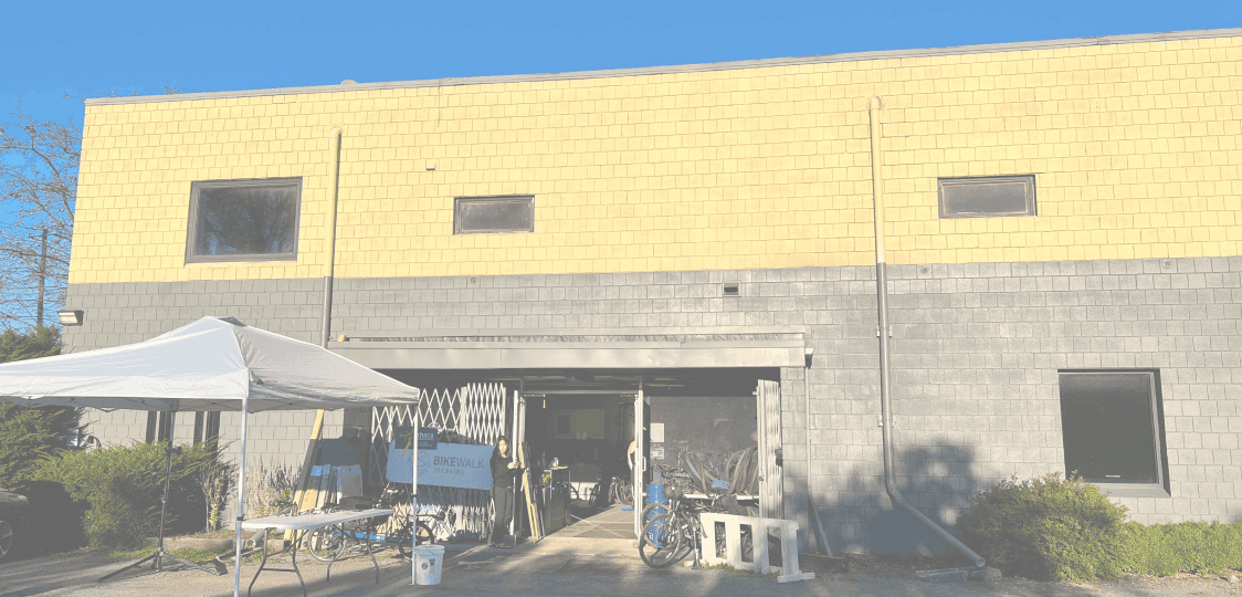
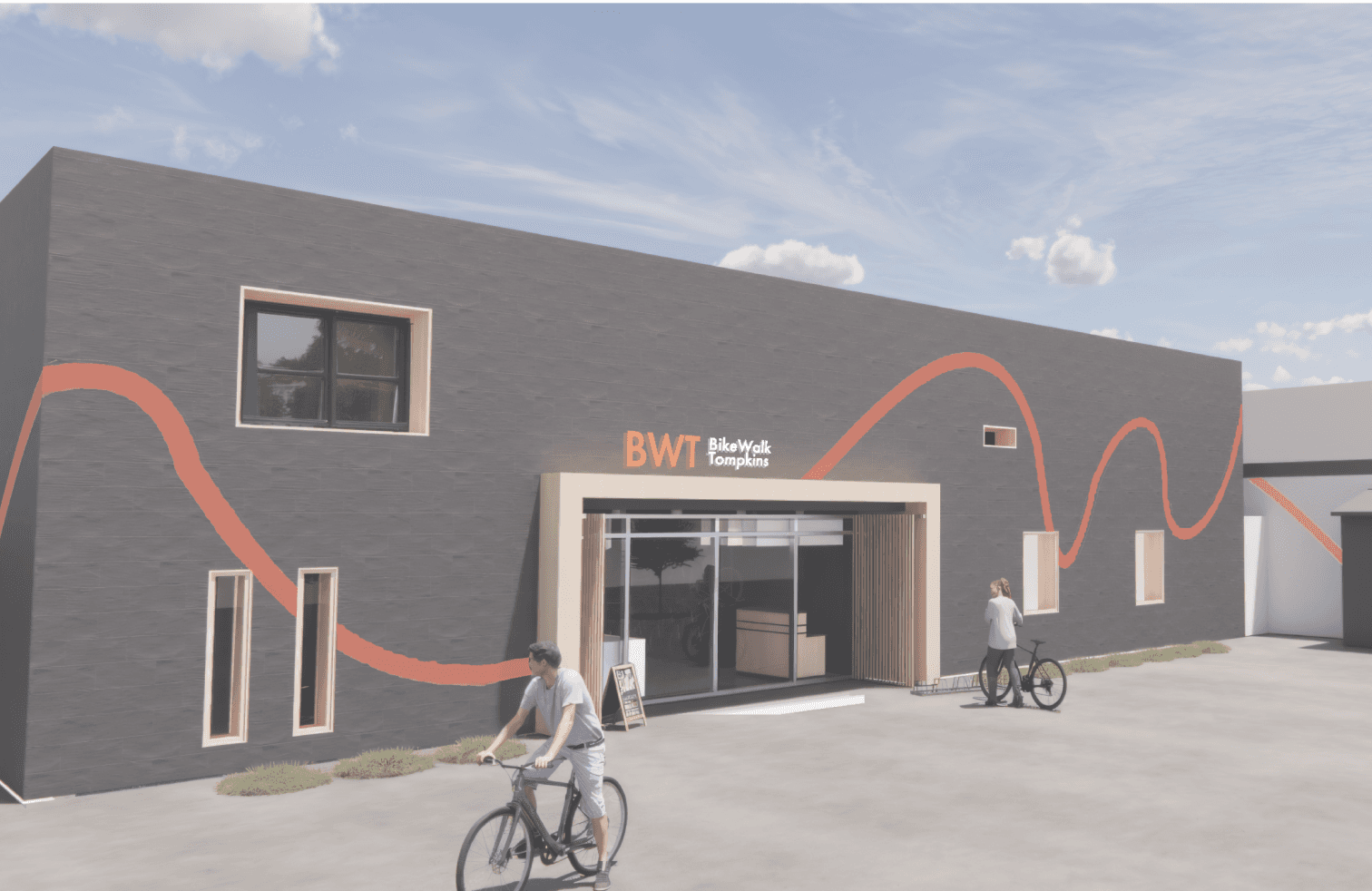
Bike Walk Tompkins is tucked on the inner side of a building on Cascadilla Street, making it difficult for people to spot from the main road.
Ideation
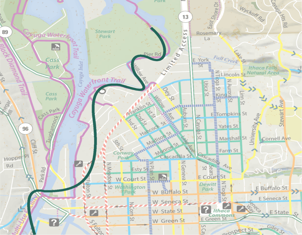
The orange tracks are derived from the bike trail that runs through Bike Walk Tompkins and emphasize our purpose of a community hub, where people from different walks of life converge and unite.
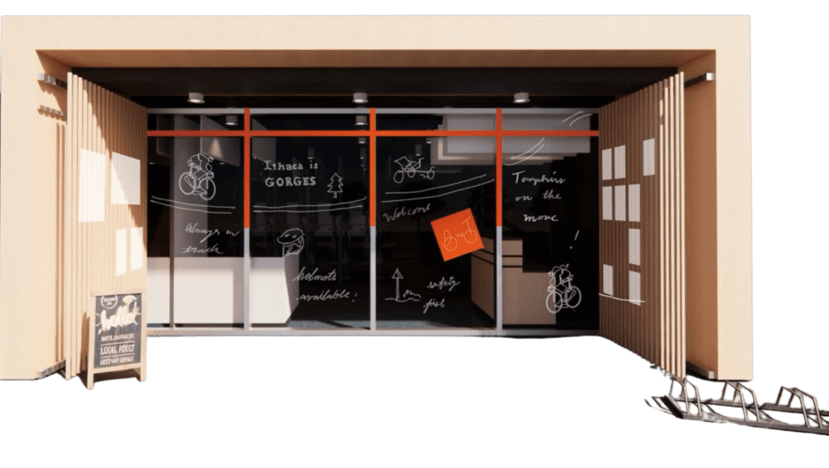
We propose extending the original painted grey color and adding orange lines that pop out, both echoing the activeness and edginess as part of the client’s goal and saving the budget on materials.
interior design
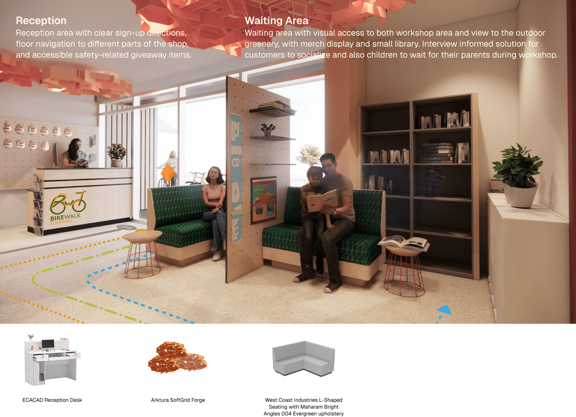
Time-Saving Floor Plan
“Designing an interior environment that functions as an efficient and energetic multi-purpose space with designated areas to increase the ease for given activities to be carried out: mechanics to repair bikes, potential customers to test ride and make purchases, support everyone to find their home in the BWT community.”



PRODUCT DESIGN
Space-Saving Bike Storage
Pain Point
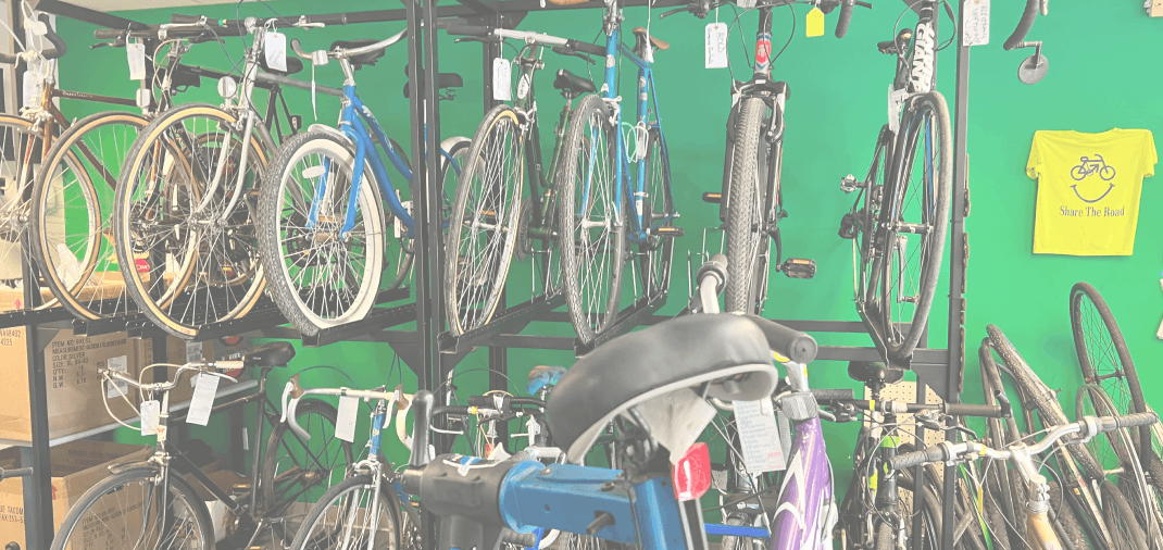
Difficulty assessing bikes within the racks & mounting bikes in 2nd level, causing body strain.
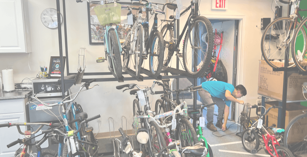
Storage couldn’t maximize efficiency and organization.
Ideation
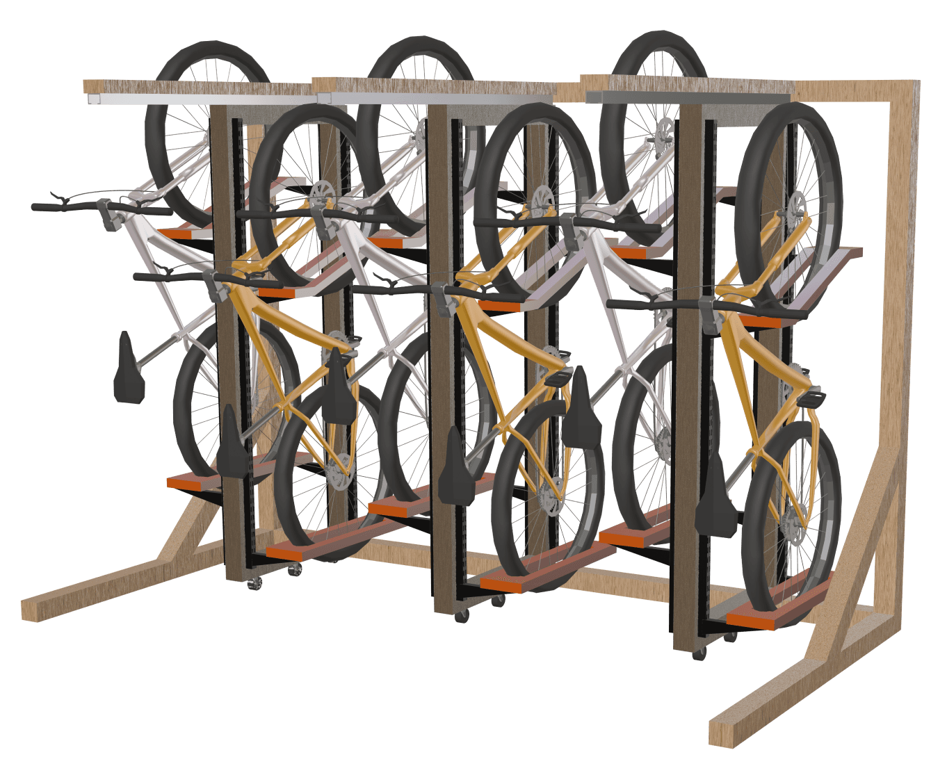
Bike Rack Perspective View
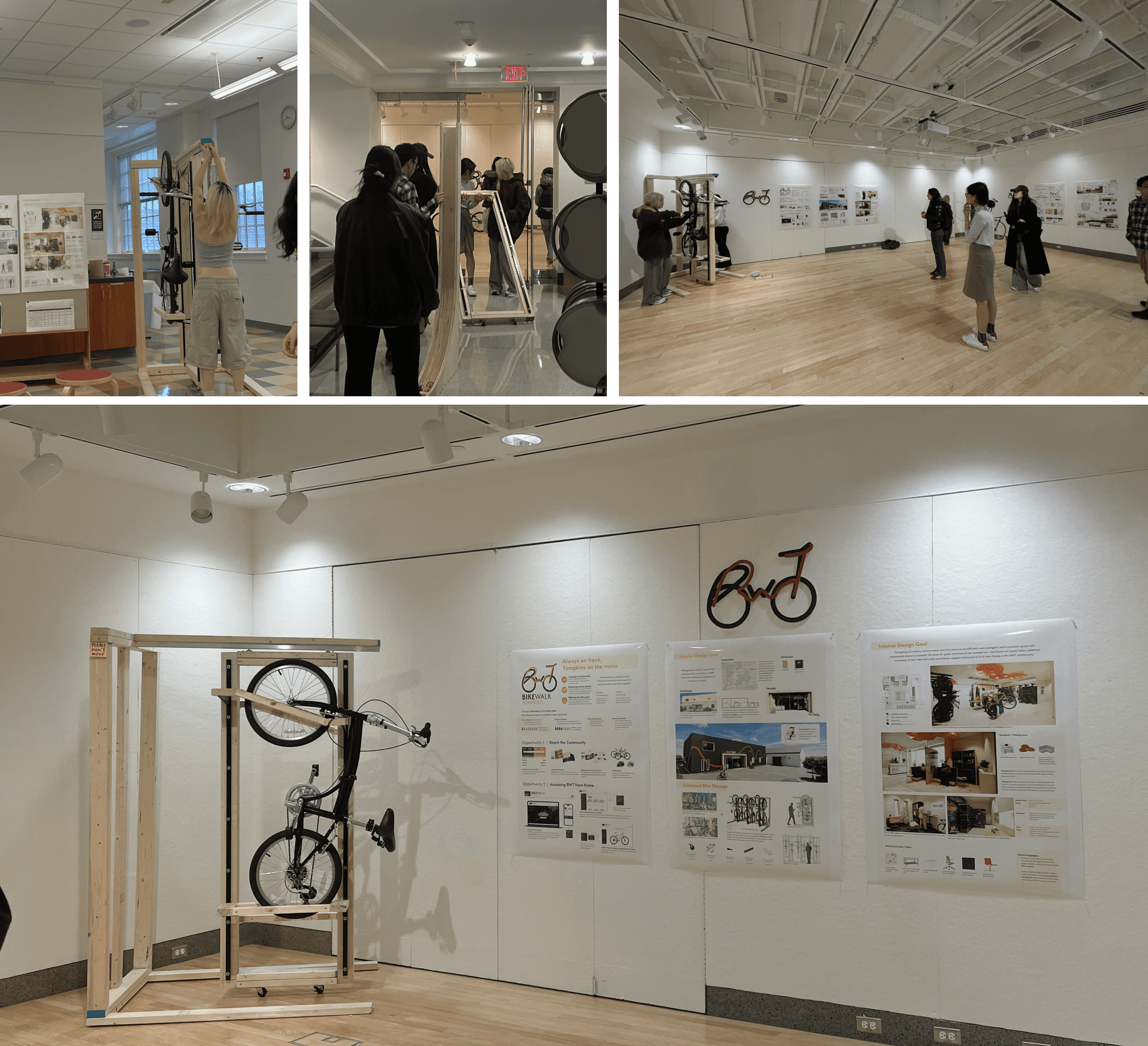
With this new design, of each unit of 1 frame having the ability to hold 2 bikes, the shop would be able to accommodate 48 bikes. Some key features are adjustable height extenders, rail + rolling mounts, wheel cradles, vertical-staggering, and increased visual access.
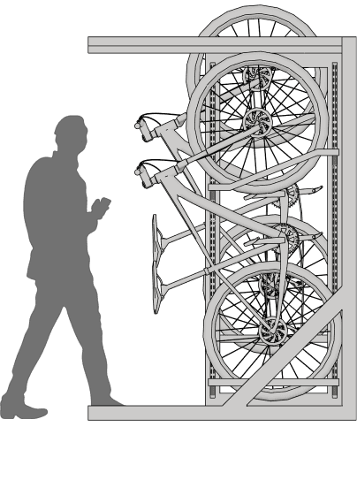
Bike Rack Side View
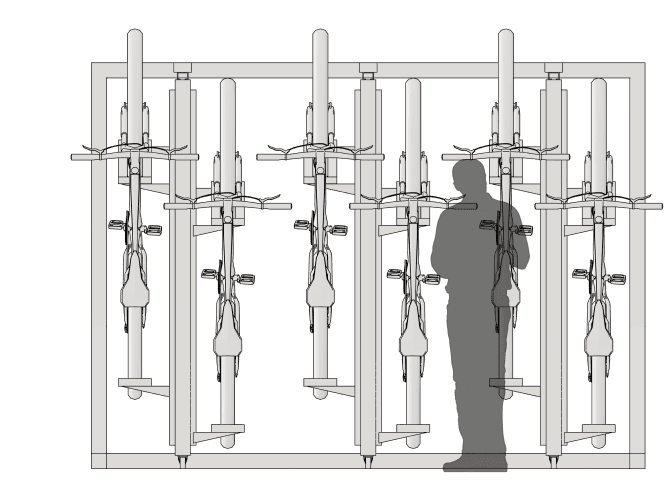
Bike Rack Front View
W: 9.72 ft.
D: 4.67 ft.
H: 7.22 ft.

Takeaways
This project strengthened my ability to design across physical, digital, and brand systems simultaneously, ensuring that each touchpoint reinforces a cohesive experience. I learned the importance of functional zoning, operational improvements, and scalable outreach strategies, and how to reframe each to help the unique metrics of a non-profit organization. Balancing budget constraints pushed me to prioritize high-impact interventions rather than aesthetic changes alone. And most importantly, this project reinforced my approach to community-centered design.
